

Configure your documentation site’s branding, appearance, and features from the Configurations panel in the web editor. Configuration changes sync in real-time with other editors on the same branch, so your team always sees the latest settings.Documentation Index
Fetch the complete documentation index at: https://mintlify-mintlify-e11b10f4.mintlify.app/llms.txt
Use this file to discover all available pages before exploring further.
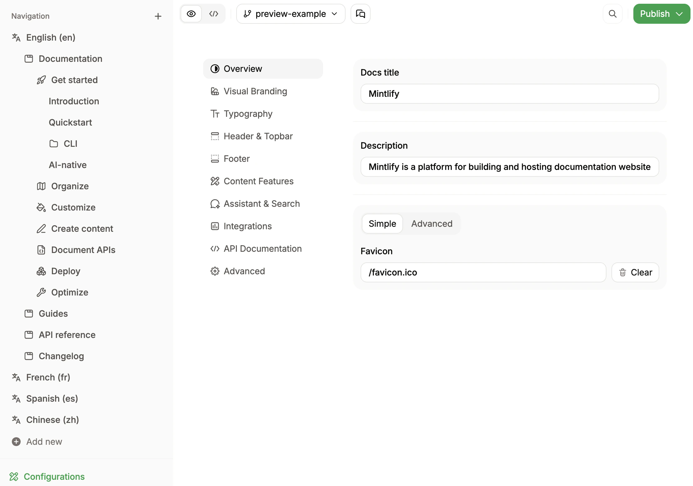
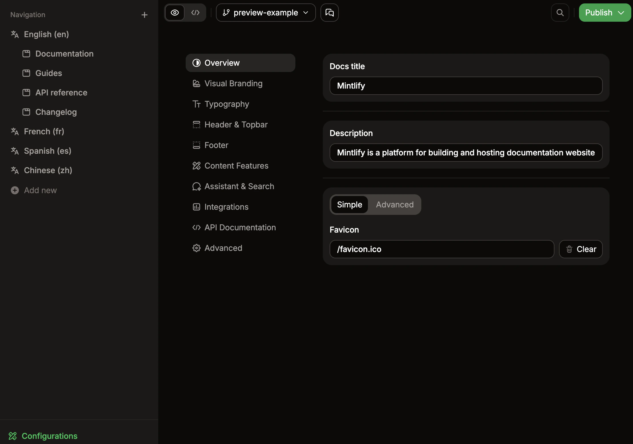
docs.json. Use the table of contents on the right to jump between sections.
General
Set your site’s identity and how it appears to visitors.- Name: The name of your project. Appears in browser tabs and search results.
- Description: Brief overview of your project. Used for SEO and AEO.
Branding
Upload the marks that identify your site.- Logo: Your brand logo. Upload PNG or JPG files. Set separate light and dark versions and an optional click-through URL. To use an SVG logo, add the file to your repository and reference its path in your
docs.json. - Favicon: Small icon that appears in browser tabs. Upload ICO, PNG, GIF, or JPG files. Set separate light and dark versions if needed.
Styling
Control your site’s visual identity and color scheme.- Theme: Choose a theme for your site’s overall appearance.
- Primary color: The main accent color used throughout your site for links, buttons, and highlights.
- Light color: Accent color used in dark mode. How themes apply this varies by theme.
- Dark color: Accent color used in light mode. How themes apply this varies by theme.
- Background color: Custom background colors for light and dark modes.
- Icon library: Icon library used for all icon properties. Defaults to
fontawesome. - Strict appearance: Lock the site to a single appearance mode and hide the theme toggle.
- Default appearance: Whether your site loads in
system,light, ordarkmode by default. - Background decoration: Apply a visual style (
gradient,grid, orwindows) to your background. - Background image: Optional background image. Set a single image or separate light and dark versions.
Typography
Replace default fonts with your brand’s typography.- Font family: Any Google Fonts family works out of the box. For a self-hosted font, provide a source URL and format (
wofforwoff2). - Weight: Typically
400for regular and700for bold. Variable fonts support precise weights like550. - Heading font: Optional override applied to all headings (
h1–h6). - Body font: Optional override applied to body text and the rest of the page.
Navbar
Add navigation elements to the top of your site.- Primary button: The main call-to-action in your header. Set the type, label, and destination URL.
- Navbar links: Additional navigation links in your header. Each link includes text and a URL.
Footer
Add links and social media handles to your site footer.- Social links: Profiles on platforms like GitHub, X, LinkedIn, Discord, YouTube, and Slack.
- Footer columns: Enable to organize footer links into up to four columns with custom headings.
Banner
Display an announcement bar across the top of every page.- Content: The banner text. Supports basic MDX formatting like links, bold, and italic. Custom components are not supported.
- Dismissible: Show a dismiss button on the right side of the banner.
- Type: Visual style.
infouses the primary brand color,warninguses an amber background, andcriticaluses a red background. Defaults toinfo. - Color: Override the banner background color with a custom hex color. Set separate light and dark values for theme-aware colors.
Thumbnail
Customize page thumbnails and social previews.- Background: Custom background image for thumbnails.
- Appearance: Render thumbnails in
lightordarkmode. When unset, thumbnails are auto-generated from your theme colors. - Font: Custom font for text in thumbnails.
Content
Customize how content appears on your site.- Code block theme: Match the docs light/dark mode with
system, always use a dark theme withdark, or pick a custom Shiki theme. - Custom code languages: Register additional syntax highlighting languages.
- Page eyebrow: Show small labels preceding page titles. Choose
sectionorbreadcrumbs. - Timestamps: Show the date the content was last modified on all pages.
- LaTeX: Load LaTeX (KaTeX) stylesheets for mathematical notation rendering.
Context menu
Configure the quick actions surfaced in the page context menu.- Options: Multi-select dropdown of actions like
copy,view, and opening the page inchatgpt,claude,cursor, and other AI assistants. - Display: Where to display the options.
header(default) shows them in the top-of-page context menu;tocshows them in the table of contents sidebar.
Navigation
Tune navigation behavior across your site.- Drilldown: Auto-navigate to the first page when a user clicks a navigation group.
Search
Customize the search experience and feedback.- Search placeholder: The text that appears in the search box before users type. Default is
Search or ask. - Feedback: Show thumbs-up and thumbs-down buttons or a “Suggest edits” link on every page.
API reference
Document your API endpoints.- OpenAPI specs: Add OpenAPI specification files to generate API reference pages.
- AsyncAPI specs: Add AsyncAPI specification files to generate API reference pages.
- MDX server: Custom MDX server endpoints for the API playground.
- Playground display: Show the interactive API playground, the simple API playground, or no API playground.
- Proxy server: Enable or disable the proxy server for API requests.
mdx.schema: Whether to render the schema section on API reference pages.
Redirects
Use the Redirects section to add, edit, search, and remove redirects without manually editing yourdocs.json file. Redirects send users from old URLs to new ones, which is useful when you rename pages or restructure your documentation. For more information, see Redirects.
Each redirect has the following fields:
- Source: The path to redirect from, like
/old-path. Supports wildcards. - Destination: The path to redirect to, like
/new-path. Supports wildcards. - Status: The HTTP status code for the redirect.
308: Permanent redirect. Use this for content that has moved permanently. This is the default status.307: Temporary redirect. Use this when the move is temporary.
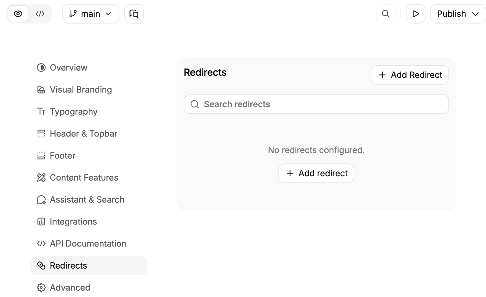
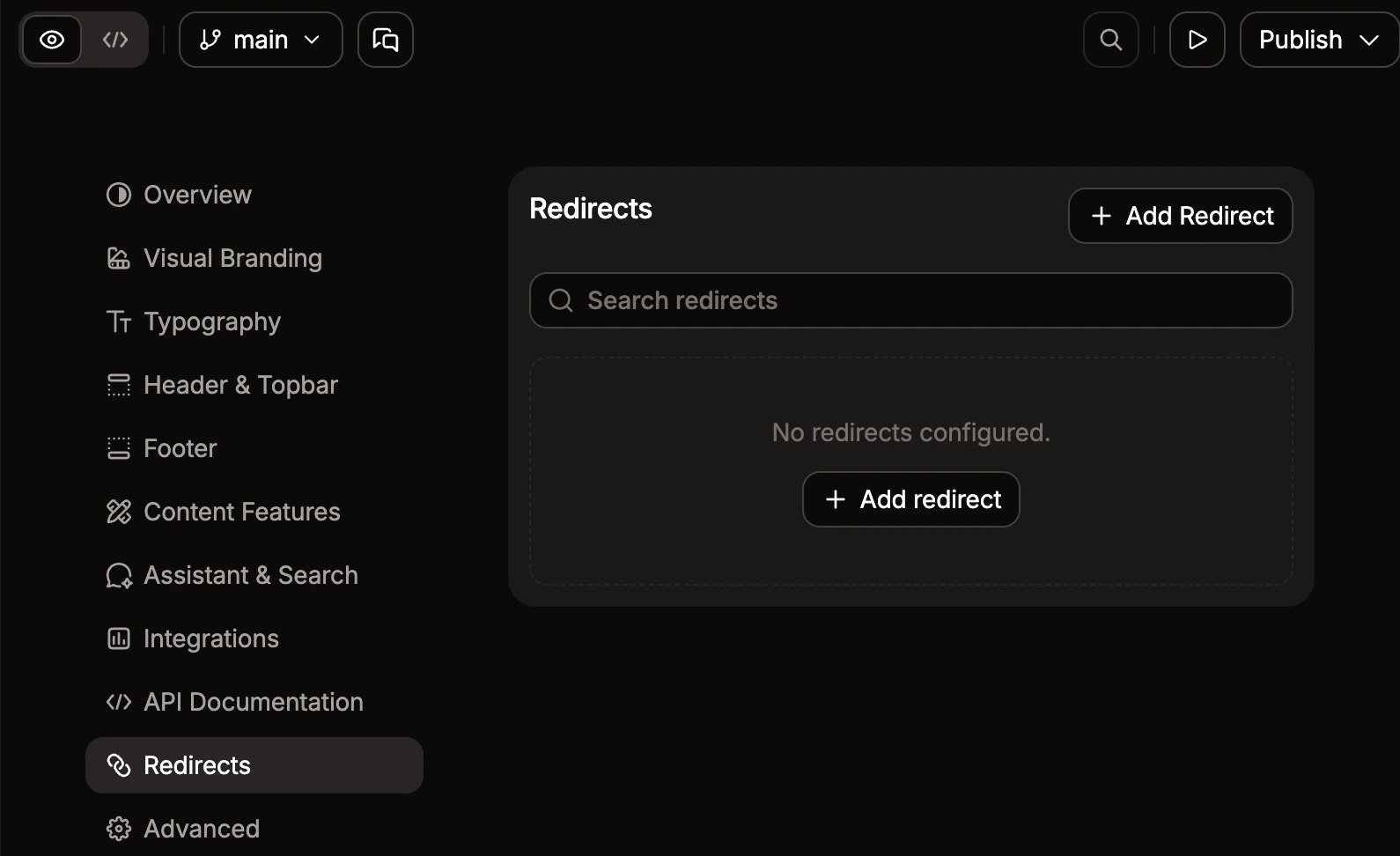
- Click Add redirect.
- Enter the source and destination.
- Click Save.
SEO
Configure metatags and indexing for search engines.- Metatags: Custom
<meta>tags applied across your site. Add key-value pairs for tags likeog:imageortwitter:card. - Indexing: Choose whether to index hidden pages.
Analytics
Connect analytics platforms to track visitor behavior. Supported providers include Amplitude, Mixpanel, Heap, Google Analytics, Google Tag Manager, PostHog, Plausible, Fathom, Segment, Hightouch, Hotjar, LogRocket, Microsoft Clarity, Intercom, Clearbit, and more. Each entry renders as an inline row. Use the X icon to remove an integration.404 page
Customize the experience when a user lands on a missing page.- Redirect to home: When on, missing pages redirect to your home page. When off, a 404 page is shown and you can customize the title and description below.
- Title: Heading shown on the 404 page.
- Description: Subheading shown on the 404 page.